Building a Community for KOYA

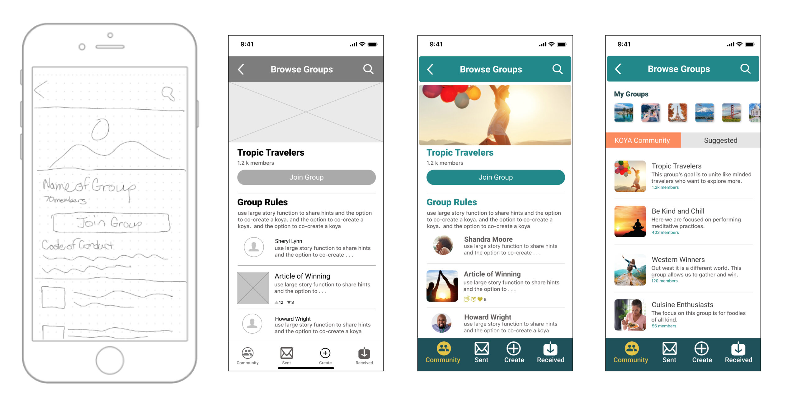
GIFTING MAGICAL MOMENTS FROM AFAR

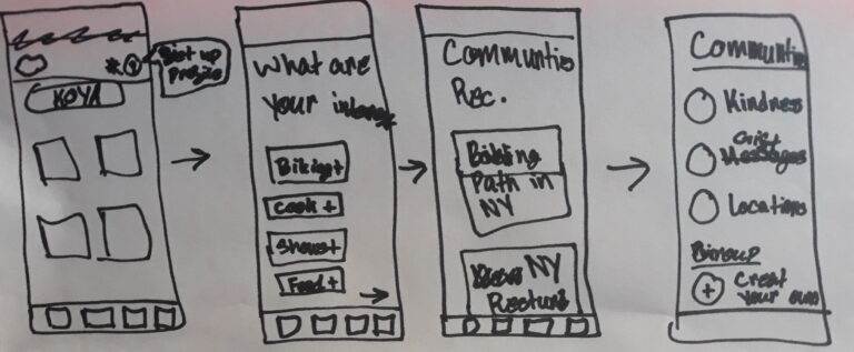
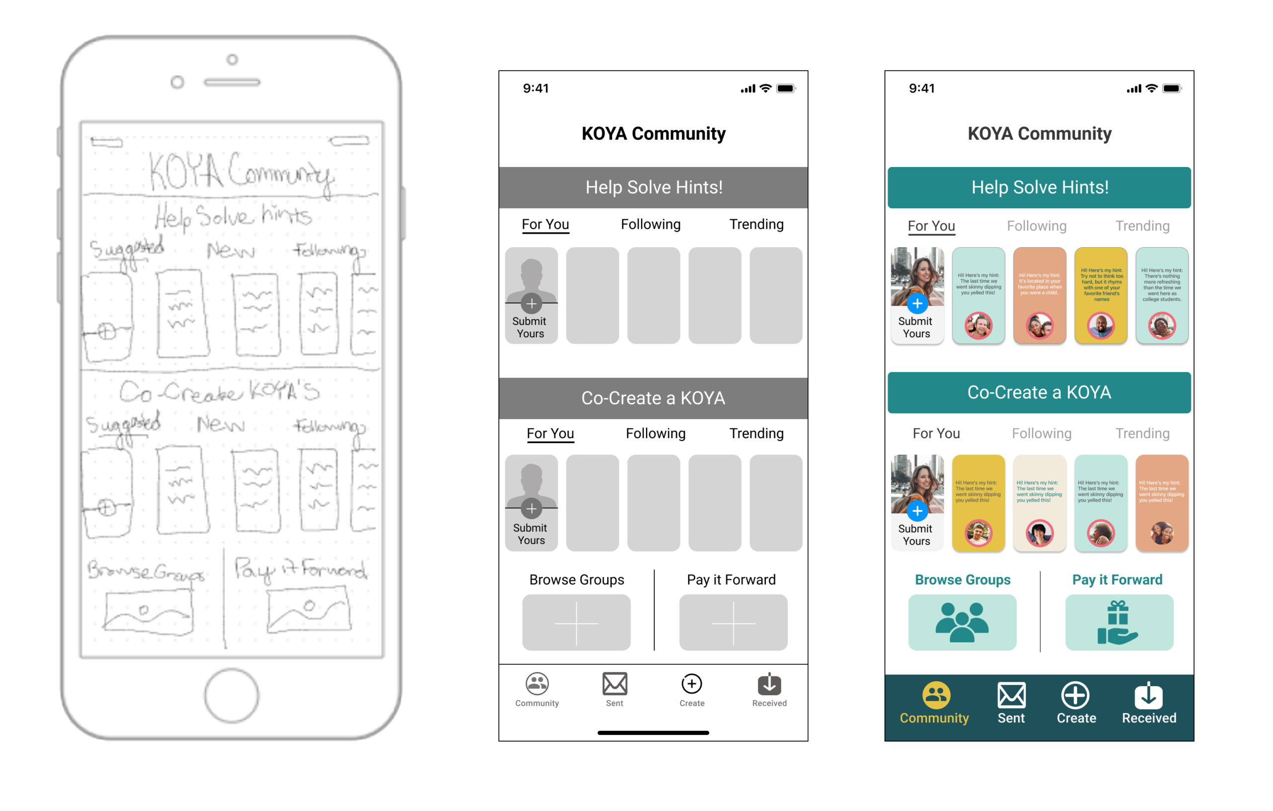
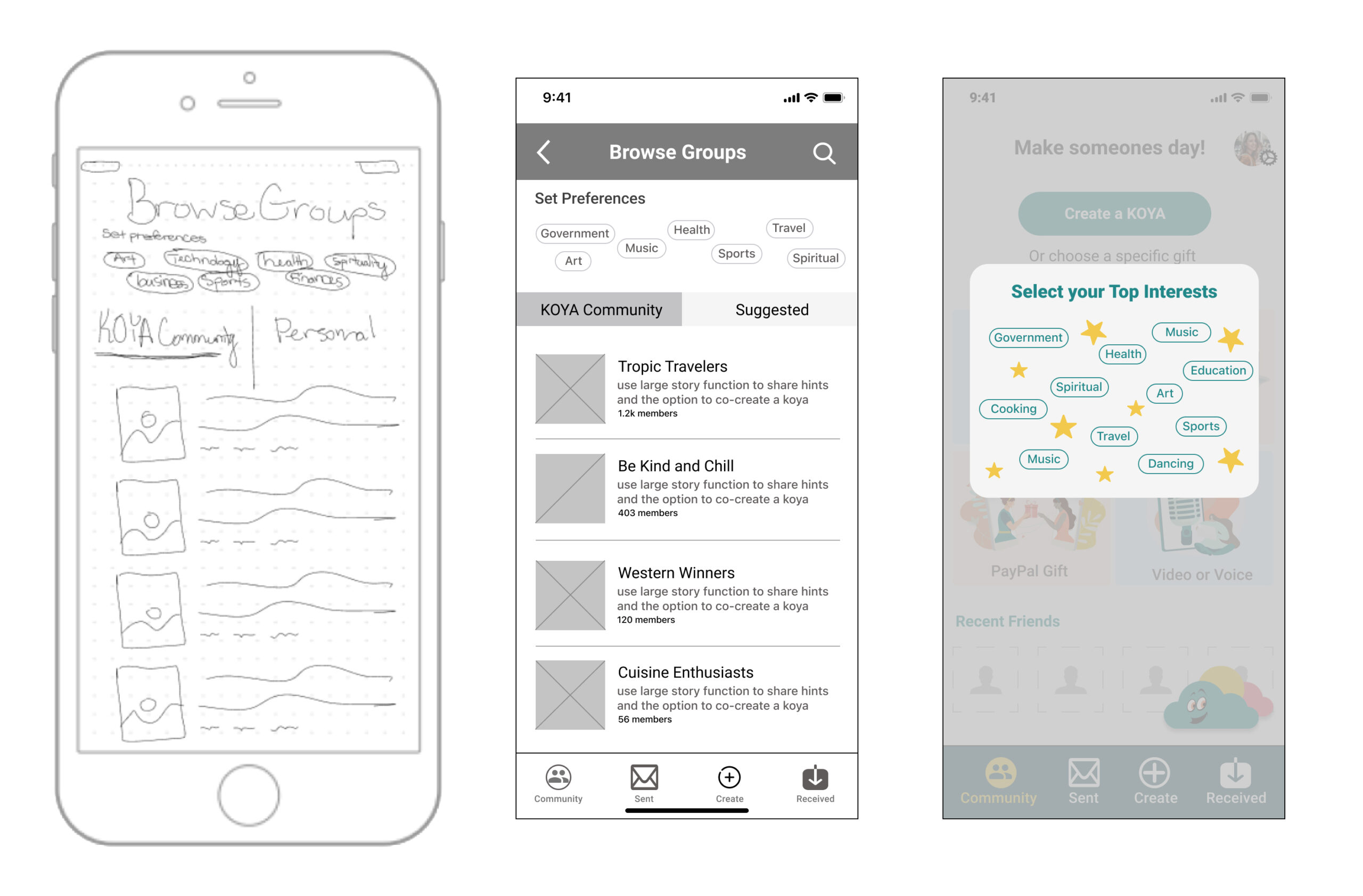
KOYA is a virtual gift-giving app that uses geolocation to make memorable and personalized experiences. Users get to send messages at a specific time and place, which makes the experience memorable for the user and the gift receiver.
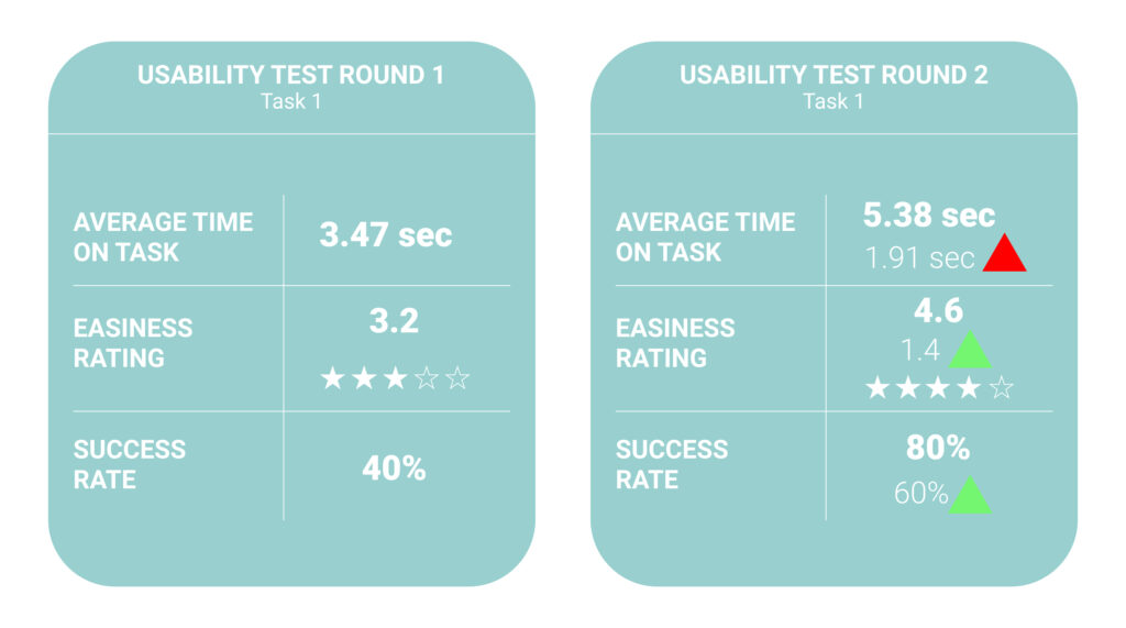
MY ROLE

UX Researcher | UI Designer | Prototype 

Defining the Problem

Opportunity
KOYA’s founders wanted to grow the engagement within their current community. Doing this allows for constant interaction with the app and can lead to new conversions. After learning about KOYA’s desire to have a feature to help solve hints, co-create a KOYA, and pay it forward, we aligned our research to come up with a design that utilizes those features along with a groups section.
Challenge
  • Receiving a KOYA lacks a place for users to connect and share input within the app.
  • Since there isn’t a common connection point users are spending less time in the app as they could if they were more engaged.
  • How might we include a place in the app that allows for users to share input and engage in a more connected way?

    Research: Comparative Analysis

    Overview
    Evaluate how apps are utilizing community groups and engaging current users.

    Methodology

    Five apps were picked that included social communities within their space. After analyzing the key features that allow for social engagement we made a list of the most common features allowing our team to identify popular features for KOYA. 

    Takeaways

    We found that sharing to other social platforms is an essential feature to include in this new section. Additionally quick responses, comments and having an option to post are other features to consider

    Research Kickoff

    BUSINESS VALUES & PRINCIPLES
    Before starting research it was important for us to revisit the principles and vision statement KOYA seeks to emulate. By doing this in the beginning allows us to align with the business goals and the essence of KOYA’s brand.
    Takeaways
  • Empower more meaningfully connected relationships
  • End the loneliness epidemic
  • Connection, integrity, kindness, intentionality + love for all
  • The voice of our brand is fun & inspiring. We lead with kindness in everything we communicate.
  • We aim to visually communicate the importance of: kindness as well as, togetherness / community.
  • FOR OUR RESEARCH WE NEED TO DISCOVER:
  • What are users habits, how do they spend their time in social networks?
  • What are some of the challenges and pain points in those spaces?
  • What are they trying to do and achieve?
  • What do they want and need?
  • USER INTERVIEWS
    We conducted 5 user interviews with people within our target audience between the ages of 19 to 35. We asked them questions around the topic of groups within social media. Afterwards we synthesized the trends from the user interviews using an affinity map, and came up with insights.

    Affinity Mapping

    To help synthesize key findings during user interviews, we organized a large number of our learnings into their natural relationships. Information was categorized based on their relationship to one another.

    Key Insights from User Interviews

    As we continued to organize key information from our affinity map and user interviews we identified recurring themes and translated them into key insights that helped inform our user persona and other design features.

    Fuel Passions

    Users engage with groups that fuel their passions and personal interests

    Usefullness

    Users desire for a useful online community

    Support & Uplifting

    Users want groups that support and uplift them

    Marketing

    Users want to keep up with personal friends

    Personalization

    Users enjoy personalized communication

    Support

    Users want to react quickly to posts and see interactions in real time

    Persona

    Based on the trends from the user interviews, we created our persona, Julia. She was a single representation of the key trends we found during the interview process. We used the persona as reference throughout the rest of the research and design phase. Which allows us to design for the right user and if an idea comes to mind, we can ask if it aligned with what Julia needs and wants? 

    Finding Key Features with Moscow Map

    OVERVIEW
    Conducting a moscow map allows us to brainstorm and identify the main key features we want to include in the community section. Based on our user interview insights and research we did on other apps we identified features and categorized them in a Must Have and Should Have section.
  • Quick responses
  • Similar interest section
  • Suggest people and groups to follow
  • Community support
  • Crowd-source groups
  • DM for private messages
  • Share to other social media
  • Feedback and share
  • Close friends feature
  • Design Studio

    OVERVIEW
    We conducted a Design Studio session to generate multiple sketches to divergently explore the app layout.

    METHODOLOGY
    Our goal during this exercise was to explore ways to navigate this new section of the app. We found multiple pathways that would allow us to take our key features we created from our Moscow Map earlier, and incorporate them into a layout.

    TAKEAWAYS
    We identified that the community feature icon will be placed on the bottom navigation as it’s a secondary feature compared to KOYA’s main navigation.

    Low Fidelity Wireframe

    OVERVIEW
    To begin the low fidelity mockups I gathered insights from the design studio, user interviews, competitive analysis, and MoScow Map to begin the final layout. From our initial conversation with the founders we integrated sections that allow uses to help solve hints, co-create a KOYA, and pay a KOYA forward. Additionally from the user interviews I included an option that focuses on their preferences and is shaped to their particular interests. (Browse Groups)
    TAKEAWAYS
    The basic structure allows for a quick insight into how this overall feature acts a framework. Creating a low fidelity mockup also allowed us to envision the overall layout and flow of the navigation of this new feature. After sketching the initial layout and getting feedback from our team we moved the low fidelity mockups into mid fidelity wireframes where we prototyped and tested the usability of the new feature.
    COMMUNITY HOME PAGE Here users will land on the homepage of the new community section. On the initial page users will find the option to, help solve hints, co-creating a KOYA, browse groups, and pay it forward. This serves as the springboard for each major section in the community.

    HELP SOLVE HINTS

    Here users will land on the homepage of the new community section. On the initial page users will find the option to, help solve hints, co-creating a KOYA, browse groups, and pay it forward. This serves as the springboard for each major section in the community.

    PAY IT FORWARD


    From the home page, when a user selects the Pay it Forward section, it moves to the pay it forward page. This page allows the user to see people to pay it forward from either the KOYA community, or those they are following. It also shows a list after they select which area they want, and each person will be ranked with the last time they received a KOYA.

    CO-CREATE A KOYA


    From the home page, when a user selects the co-create a KOYA title of stories, it moves to the co-created page. This page allows the user to see either options to co-create a KOYA that belong to suggested users, new co-creations from those they are following.

    Usability Test

    OVERVIEW
    We conducted 5 usability tests to see how well users within the target audience were able to navigate the new layout. Because we are only presenting the minimum viable product (MVP)
    METHODOLOGY
    We did these tests in Zoom and had a scenario and tasks for each user to do. Using a prototype we made in Figma we observed the time on task, how many clicks and any additional comments users gave, as well as the overall easiness of their ability to complete a task.
    WHAT WE TESTED
    We tested users ability to navigate through the app to the new community section and then join a group. Testing the ability to navigate is key for new features because it allows us how well a layout is learnable as well as its overall usability.

    Interactive Prototypes

    Going High Fidelity

    WHAT WE LEARNED
  • Bottom navigation was too small
  • Users were confused with set preferences
  • General interest in different groups
  • Changes from Usability Testing
     
      Higher contrast in the bottom navigation
      “Set preferences” as a pop up
      Include the groups that users are in
    Usability Test Results
     
  • From the mid-fidelity to high fidelity prototype the average time on task increased by 1.91 seconds
  • The easiness rating increased by 1.4 starts
  • The overall success rate increased by 60%